Flow Metrics: Why PM Tools Fail and How to Fix It
Velocity, Cycle Time, WIP–why do your retros go in circles while Trello, Asana, and Monday leave you flying blind? Discover what flow metrics really are, why they're missing from most PM tools, and how to unlock them for your ops team.
Georg Singer··12 min read
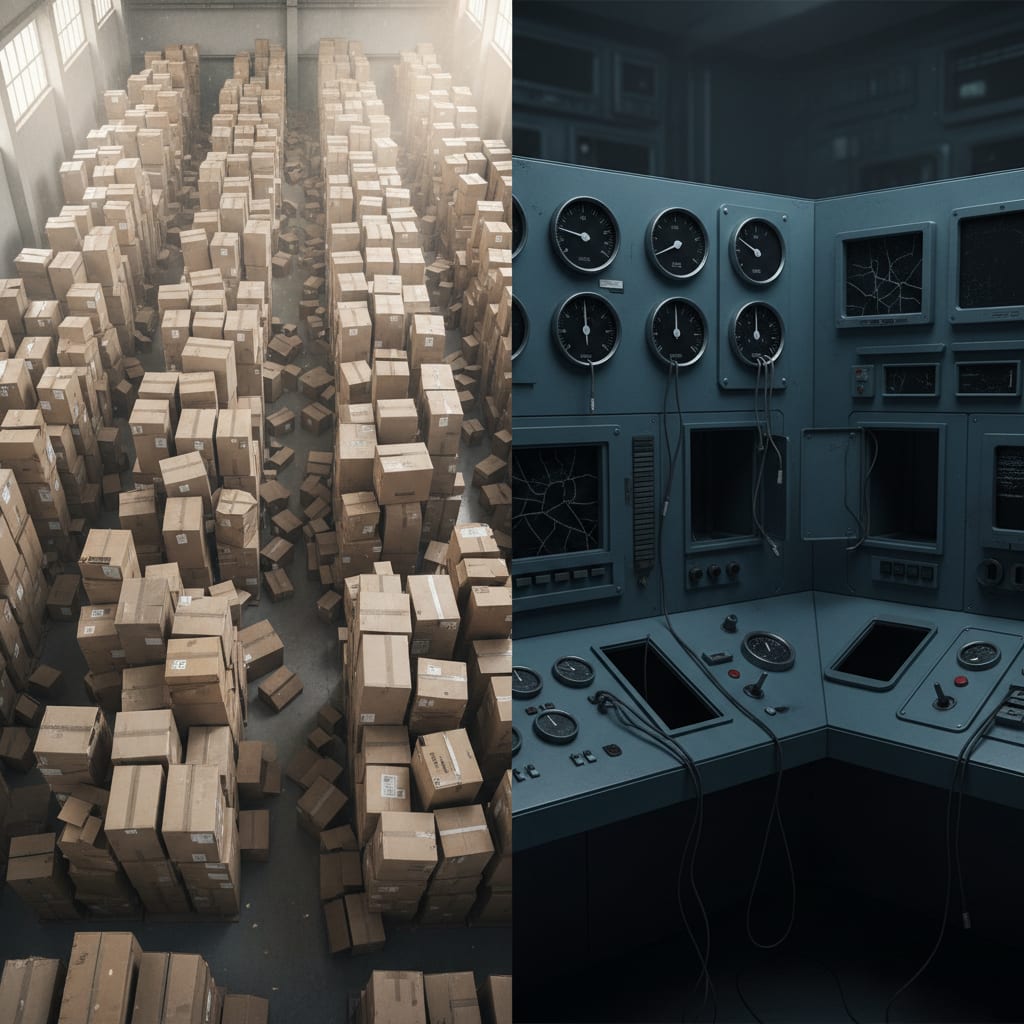
You know the drill: sprint review's dragging on, five cards done, three stuck "In Progress" for two weeks straight. Someone quietly says, "I don't think we were very productive this sprint." Nobody argues. But can anyone prove it? Nope.
Velocity? Not tracked. Cycle Time? No clue. WIP? Feels way too high–but where, exactly?
If that feels uncomfortably familiar, you're not alone. This is business as usual for ops teams managing work in tools that just weren't designed for flow analytics. The consequences go way beyond a boring retro.
Why Your Sprint Review Feels Like Flying Blind
Let"s be honest–most retros feel like déjà vu. You talk about bottlenecks, make plans to improve, and next sprint... nothing changes. Sound familiar?
According to the Trend-Research Ops-PM-Teams SaaS 2025, an eye-opening 70–80% of retro action items never get implemented. That"s not just a discipline problem–it"s a feedback problem. You can"t see what"s actually changing.
And it gets worse. Asana"s Anatomy of Work Index found that 60% of knowledge workers" time vanishes into "work about work"–chasing status, switching apps, manually merging info. Only 27% of your team's time is actually spent on skilled work that moves the needle.
That means you"re probably wasting more than half your week just trying to figure out what"s happening. Flow metrics could show you exactly where your time is going–but they"re usually missing from your PM tools. So why are these numbers invisible?
Flow Metrics: The Numbers Your Tools Don"t Want You to See
Flow metrics like Velocity, Cycle Time, Work In Progress (WIP), and Throughput aren"t just vanity stats–they measure the actual flow of work through your team. The difference? Classic tools like Trello, Asana, and Monday were built for project tracking, not for analyzing flow.
- Velocity tells you how much work you finish in a sprint (usually in story points).
- Cycle Time measures how long it takes a task to go from "started" to "done"–no estimation needed, just timestamps.
- WIP (Work in Progress) is the number of tasks in motion right now. It"s the only flow metric you can control actively.
- Throughput counts how many tasks get done over a period–regardless of what you planned.
But here"s the kicker: most PM tools don"t support these metrics natively. Their data models just aren"t built for it.
The Real Cost of Missing Flow Metrics: A Closer Look at Your Tools
Let"s dig deeper. Imagine you"re sitting in your next sprint review. You"re staring at a board, but all you see is the current state of tickets. There's no clue how long tasks are stalling, and no way to spot bottlenecks before they blow up.
From the community: On Reddit"s r/SaaS, a user nailed it:
"Feeling overwhelmed by our over-dependence on SaaS."
That"s not just frustration. It"s the reality for ops teams in SaaS companies with 50–200 employees–using an average of 87 different tools (saasoperations.com). None of them, by default, tells you how long each ticket took. So, how are you supposed to improve what you can"t see?
What Are Flow Metrics? Meet the Four Numbers That Actually Matter
You"ve probably heard the terms tossed around, but what do they actually mean for your workflow? Let"s break them down with real examples.
Velocity: How Much Work Does Your Team Really Get Done?
Velocity tracks the amount of work wrapped up in a sprint–typically measured in story points. It's a favorite for planning, but it doesn"t measure real productivity. Here's why.
You might be tempted to "game" the estimates–inflate story points so your burndown chart looks better. The output? You look fast on paper, but your actual delivery speed stays flat.
⚠️ Heads up: If you use velocity as your main KPI, teams often start estimating higher instead of actually working faster. You get prettier charts, but no real progress.
That"s why velocity is a useful planning tool, but a shaky productivity measure–especially if your story point estimates are inconsistent.
Cycle Time: How Long Does It Take to Finish Real Work?
Cycle time is the elapsed time from when your team starts actively working on a task until it"s finished. It"s independent of estimation, making it the most reliable baseline for ops teams that don"t use story points.
Let"s make this concrete: If your average cycle time jumps from 2 days to 5 days over several sprints, you know you"ve got a bottleneck somewhere–even if nobody can point to exactly where.
And here"s the twist: For teams without story points, cycle time is your only dependable baseline for capacity and bottleneck analysis. When it rises, something's blocking your flow.
WIP (Work in Progress): How Much Stuff Are You Juggling at Once?
Ever feel like you"re spinning too many plates? That"s WIP–the number of tasks in motion at the same time. A WIP limit is simply the max number of tasks a person or team is allowed to handle at once. It"s not just a metric–it"s a lever you can pull to fix your process.
Here"s the math: Little"s Law says Cycle Time = WIP ÷ Throughput
So, if you raise your WIP without pushing throughput up, your cycle time has to increase. More parallel tasks = slower overall delivery.
Throughput: What Did You Actually Finish?
Throughput is brutally honest: it just counts how many tickets you closed in a given time. Unlike velocity, it ignores what you planned and focuses on what you actually shipped. If you don"t run formal sprints, throughput is a better starting point for planning your team"s capacity. It cuts through estimation games and shows true delivery.
Now that you know what flow metrics are, let"s see why your current PM tool probably can"t help you.
Why Do Trello, Asana, and Monday Fail at Flow Metrics? (It's Not a Bug–It's by Design)
You might think it"s just a missing feature. It"s not. These tools weren"t built for flow analysis–they were built for project tracking. That"s a fundamental design choice, not an oversight.
And the cost? According to the SaaS Sprawl Report (Spendflo/Nintex), 87% of companies say SaaS sprawl is a moderate to serious financial hit. But most ops teams don"t fill the gap–because switching tools is expensive, and nobody wants to admit the structural problem. Let"s break down how the most popular PM tools fall short.
Trello: Great Kanban, No Time Machine
Trello"s data model only tracks the current state of a card–what list it"s in right now. It doesn"t natively tell you when a card moved from "To Do" to "In Progress" to "Done." The historical timeline is buried in each card"s activity log, but there"s no built-in interface to analyze it. So, if you want to measure cycle time in Trello, you"re out of luck–unless you spring for an add-on or hack together exports.
Asana and Monday: Deadlines Over Flow
Asana and Monday focus on tracking deadlines, milestones, and project outputs. Their data models are all about "when will this project ship?"–not "how does work flow through the team?" The result? Their timeline views show planned finish dates, but have no clue how fast your team is actually working. For capacity and bottleneck analysis, they"re almost useless.
Jira: It Can Do Flow Metrics–But at What Cost?
Jira actually does have native flow metrics: velocity charts, cycle time diagrams, cumulative flow diagrams. But there"s a catch. Jira"s data model is built for dev teams: story points, sprints, epics, issue types. If you"re an ops team juggling bug reports, internal requests, and process improvements, Jira"s complexity is massive overkill. Bringing in Jira for flow metrics alone is like buying a moving truck because you need to haul a couple boxes.
Tool Comparison: Which PM Tools Support Flow Metrics Natively?
Here"s where the rubber meets the road. Most PM tools simply don"t deliver the insights you need–out of the box.
| Tool | Velocity | Cycle Time | WIP Tracking | Throughput |
|---|---|---|---|---|
| Trello | ✗ | ✗ (add-on only) | ✗ native | ✗ |
| Asana | ✗ | ✗ | ✗ | ✗ |
| Monday.com | ✗ | ✗ | ✗ | partial (dashboards) |
| Linear | ✓ | ✓ | ✗ native | ✓ |
| Jira | ✓ | ✓ | ✓ | ✓ |
Legend: ✓ = native, ✗ = missing or only via paid add-on
So, out of the top five PM tools, three don"t support any flow metrics natively. Linear and Jira do, but both are developer-centric and not a natural fit for most ops teams.
SwiftRun automates repetitive workflows with AI agents – so your team can focus on what matters.
Metrics Data vs. Metrics Insights: Why Charts Alone Won"t Fix Your Retro
So, you install a Trello add-on like Screenful. Now you"ve got charts–cycle time bars, throughput curves, WIP trendlines. Problem solved, right? Not so fast.
Here"s how your retro looks without flow data:
The team"s in a room. Three tickets have been "In Progress" for 12 days. Someone says, "We probably had too many tasks at once." Why? Unclear. How many is "too many"? Nobody knows. Will it change next sprint? "We"ll do better." Somehow.
Now, with cycle time analysis:
The cycle time chart shows that tickets in "Review" sit there an average of 4.2 days–every other stage is under a day. The real problem isn"t how fast you work–it"s a review bottleneck. WIP in review: 6 tickets, but the team can realistically review 2 at a time. Solution: Set a WIP limit of 3 for "Review," and add a standing weekly review slot.
See the difference? It"s not about having more data–it"s about connecting numbers to decisions. And that"s where most add-ons fall short. According to ProProfs Workflow Automation Statistics, half of all teams spend at least a day per month manually piecing together project status info. Add-ons give you diagrams–but interpreting them and turning them into action is still up to you. Most teams just don"t do it.
My take: Reporting add-ons answer "What happened?"–but not "What should we do next?". That leap from data to decision is extra work, and that"s why those retro action items get lost–in 70–80% of cases, nothing changes.
Which Flow Metric Answers Which Question? Your Ops Team"s Decision Matrix
Not every metric fits every situation. Here"s a quick guide to what each one reveals–and when to use it.
| The Question You"re Asking | Right Metric | Why |
|---|---|---|
| Are we getting faster or slower? | Cycle Time | Shows trends over time, no estimates needed |
| Are we juggling too much at once? | WIP | Actively controllable, not just measured |
| What did we actually finish? | Throughput | Ignores estimation games, counts real outcomes |
| Can we plan the next sprint realistically? | Velocity (with caution) | Only if estimates are consistent |
| Where is the team stuck? | Cycle Time + WIP | WIP shows where, Cycle Time shows how long |
Now, why does this matter? 75% of project managers say they"re asked to do too much with too few resources. WIP limits aren"t an excuse–they"re your evidence-based argument to push back with stakeholders.
WIP is the only flow metric you actively manage–not just report. Every other metric tells you what was; WIP lets you change what will be. For ops teams, that makes it your single most powerful tool.
If you don"t use story points? Start with cycle time. When that"s stable, WIP monitoring gives you the biggest lever for real improvement.
How to Get Started: Flow Metrics Without Switching Tools
Let"s get practical. Trello can export its data as CSV. With some Excel elbow grease, you can reverse-engineer cycle times from activity logs. It"s possible–but don"t expect it to scale.
Here"s the business case:
Efficiency gain per Asana: 4.9 hours/week/person
× 8-person ops team
× 52 weeks
= 2,038 hours/year

At €60 internal hourly rate:
→ ~€122,000/year potential–or 50.9 person-weeks
Even if you only realize 20% of that? That"s still 10 person-weeks reclaimed for an 8-person team. Not pocket change. But here"s the real problem: the data is there–buried in activity logs, status histories, timestamps–but no native interface turns it into insights you can use.
So what"s next? Here"s your checklist for taking action:
- Export board data and timestamps from your current tool
- Build a simple cycle time tracker in Excel (start small)
- Set visible WIP limits for your most overloaded status columns
- Share cycle time trends at every retro–spot bottlenecks early
- Push for tools or plugins that connect data to real decisions
Ready to start seeing your team"s flow clearly? SwiftRun.ai automatically pulls flow metrics from your existing tools, so you can focus on action, not analysis. Start free today–no credit card required.
Wrapping Up: Why Flow Metrics Are Your Ops Team"s Secret Weapon
Let"s face it–if you can"t see your team"s real bottlenecks, you"re stuck guessing. Most PM tools aren"t built for flow analytics, and that's not changing soon.
But you can start capturing flow metrics with what you already have–if you"re willing to export, analyze, and act. Even a rough cycle time trend is better than flying blind.
The bottom line: Flow metrics don"t just make you look smart in retros–they"re your best shot at reclaiming lost time, protecting your team from overload, and finally breaking the retro-to-sprint gap. Start with cycle time and WIP. Make your numbers work for you–not the other way around.
Related Articles:
- What Is Tool Sprawl? How SaaS Teams Lose $200K Annually to App Overload (and Context Switching)
- What Is Composable Architecture in PM Tools–and Why Ops Teams Need It Even More Than Devs
Ready to finally see what's really happening in your development process and banish those bottlenecks? Head over to SwiftRun.ai to discover how to get your flow metrics working for you.
Sources: Asana Anatomy of Work Index · Plaky PM Statistics 2026 · ProProfs Workflow Automation Statistics · SaaS Sprawl Report (Spendflo/Nintex) · 4.9 hours/week efficiency potential (Asana)
flow metrics pm toolsvelocity cycle time wipmeasure cycle time agilewip limit ops teamflow metrics ops teams
Related Articles

Operations & PM Teams
GTM Misalignment: How to Spot Early Warning Signs in SaaS
GTM misalignment is the #1 reason B2B SaaS companies miss revenue targets, according to Forrester (2025). But Ops PMs see the signals first. Here"s how to recognize, diagnose, and act before the problem hits your bottom line.
Jun 12, 2026·14 min read·Georg Singer

Operations & PM Teams
WIP Limits: Why Ops Teams Ignore Them at Their Peril
23 tasks 'In Progress', only one finished. That"s not bad luck–it"s Little"s Law in action. Here"s why WIP limits are the most important (and ignored) concept for Ops teams drowning in SaaS tools.
Jun 11, 2026·12 min read·Georg Singer
Operations & PM Teams
How to Fix Product and Sales Alignment in SaaS–Without New Tools
Product and Sales misalignment is the #1 reason SaaS revenue targets fail–according to Forrester. It"s a system problem, not a people problem. Here"s a four-part framework to sync Product and GTM, boost adoption, and eliminate wasted launches. No new tools required.
Jun 10, 2026·13 min read·Georg Singer